This wasn’t an easy list to make. We all know that people who love design collect favorite fonts and we remember some of the most influential movie posters of all time thanks to their fonts. Of course we also wanted to add a few noobs into the mix here too—we can’t just do the old school in a list like this.
Without further ado, here are our top 10 favorite film fonts of all time.
Back to the Future (1985)
-
Unique font created for the film by Andrew Probert

The title font was developed by Andrew Probert, who was the creative force behind the film’s DeLorean time machine design and storyboards. What began as a decidedly cheesy 80s logo evolved into a timelessly cheesy Back to the Future one-sheet and arguably the best part of the poster artwork (not to mention an indelible part of many childhoods that led to careers in art and design). Eventually the unique hand-drawn font was developed into “Time Travel,” a typeface created by David Occhino. In fact, the final product includes both the “Forward” and “Back” directions that made the font famous.
Metropolis (1927)
-
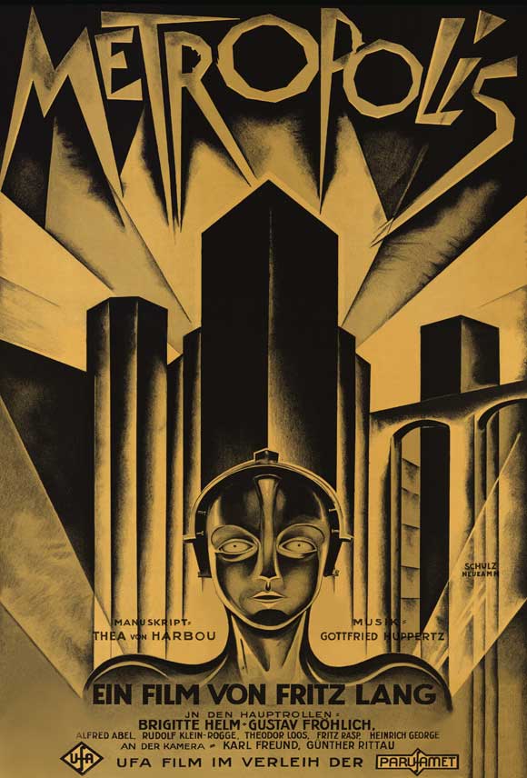
Unique, hand-lettered font created for the film by Heinz Schulz-Neudamm

Of course Metropolis achieved so many cinematic firsts, and its poster artwork is part of that amazing legacy. Poster designer Heinz Schulz-Neudamm created the artwork and masthead lettering to convey a frightening future of out of control industrialism and crushing conformity. The result is a bleak result (not to mention the most valuable movie poster in the world today).
American Sniper (2014)
-
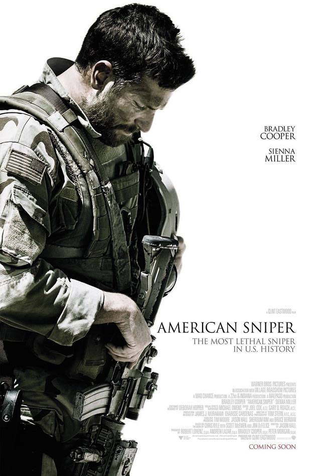
Modified version of Trajan

Trajan is all over the place, so why are we bothering to choose it here? Because this is an interesting and effective use of this font. Instead of using it to suggest heroism and adventure as usual, the imagery and the font and words suggest the ambivalence and torn feelings the movie itself will evoke in viewers. At the top of the poster we see the lead character looking away with his head down-turned, his gaze directing our eyes at last towards the far less noticeable title. His face looks fairly tortured and the font itself feels familiar. This is because it is based on Trajan, designed by Carol Twombly, which was itself inspired by the typography carved into the monuments of ancient Rome. This in turn evokes a common historical style of typography for war monuments throughout Europe and also here in the US. The result is at once sobering and disconcerting, yet subtle.
Pulp Fiction (1994)
-
ITC Benguiat

ITC Benguiat was created typographer Ed Benguiat in 1978 and has since been seized regularly by Quentin Tarantino to provide a 70s look that is absolutely on point. It is one of those fonts that looked dated soon after it was created until it gained new life thanks to a combination of kitsch and nostalgia from the Tarantino fanbase.
2001: A Space Odyssey (1968)
-
Futura (Extra Bold)

Created by Paul Renner in 1927 during the Bauhaus era, Futura is Wes Anderson’s choice in every one of his films and it’s a repeat in many Kubrick films as well. It’s also used by many major brands, and is known as a modern looking, clean typeface. When it was used in 1968 for this film, it truly had an innovative look—so much so that it also appeared on the 1969 Apollo 11 dedication plaque.
Life of Pi (2012)
-
Futura, L and P modified

We put this here following 2001 to highlight how well Futura works as a film font. Although this is a slightly modified version and the version used for 2001 was extra bold, the feel achieved in this poster couldn’t be different although in both there is certainly the clean, unobtrusive feel that Futura is known for. The Futura seen here in the Life of Pi definitely radiates the energy the font is known for without taking away from any of the other elements of the art.
Still Alice (2014)
-
Gill Sans, modified

Gill Sans is humanist font with an orderly British look that is balanced but a light and sometimes idiosyncratic feel. Still Alice tells the story of linguistics professor Dr. Alice Howland who discovers at age 50 that she has early-onset Alzheimer’s and tries to maintain her sense of self as she struggles to cope and carry on with her life. The contrast of the intellectual fearing the loss of her mind and self and the contrast of the humanistic elements and stylized sans work beautifully, and the understated font places the attention on the wonderful image of Alice where it ought to be.
Alien (1979)
-
Helvetica Black

Helvetica was created by Max Meidinger in 1957; Meidinger intended to create a font devoid of inherent meaning for many uses. Since that time it has become known for being essentially an “invisible” font, neutral and ubiquitous enough to be seen almost everywhere. His success is wonderfully apparent in the way that the five simple letters of the title on this poster have come to suggest so much horror so effortlessly. The poster itself was designed by Philip Gips and Steve Frankfurt, and the spacing of the letters and the images behind them force the viewer to resolve the images and then translate the word, further unsettling the reader.
Annie Hall (1977)
-
Windsor FF-Elongated

This was the golden age of Woody Allen to be sure, and white Windsor FF-Elongated on a black background is his signature font and look. This has functioned as a powerful source of branding, but it also provides a certain emotional feel for these movies based on a nostalgia that this font offers.
Vertigo (1958)
-
Unique, hand-drawn lettering by Saul Bass

Saul Bass created many unforgettable movie posters, but this is one of his best. This lettering goes a long way towards establishing the tense, unsettling mood of the film, showing us an unstable protagonist and a plot that throws us off many times with twists and surprises. Almost 60 years later it’s easy to recognize this lettering and instantly get an emotional response from it.