What are the most popular logos in the United States today? This isn’t an easy question to answer, and everyone has different ideas. As advertising and marketing grow ever more competitive, brands compete for recognition, and we each see hundreds of logos every day. However, we gave it a shot. Here are the most popular logos in the United States, according to us.
Target
The distinctive flat design, bright red logo for Target is recognized almost everywhere. No words needed: you can tell exactly what it is by looking at it, and even a stranger who had never seen a Target store could probably understand what they were looking at (even if they didn’t know what they’d find there).
GE
General Electric’s iconic logo was designed in the 1890s, and it hasn’t changed much at all. It has a vintage vibe because it’s the real deal, with a classic trustworthy visual appeal radiating from a basic shape and colors with a sort of art nouveau font.
Visa
Since the Visa logo appears almost everywhere you can buy something—including online—it’s no wonder that it enjoys such brand recognition. Since 2006 the design has been updated for a crisper, simpler look that taps into our collective cultural memory of the old logo and its blue and gold colors.
Starbucks
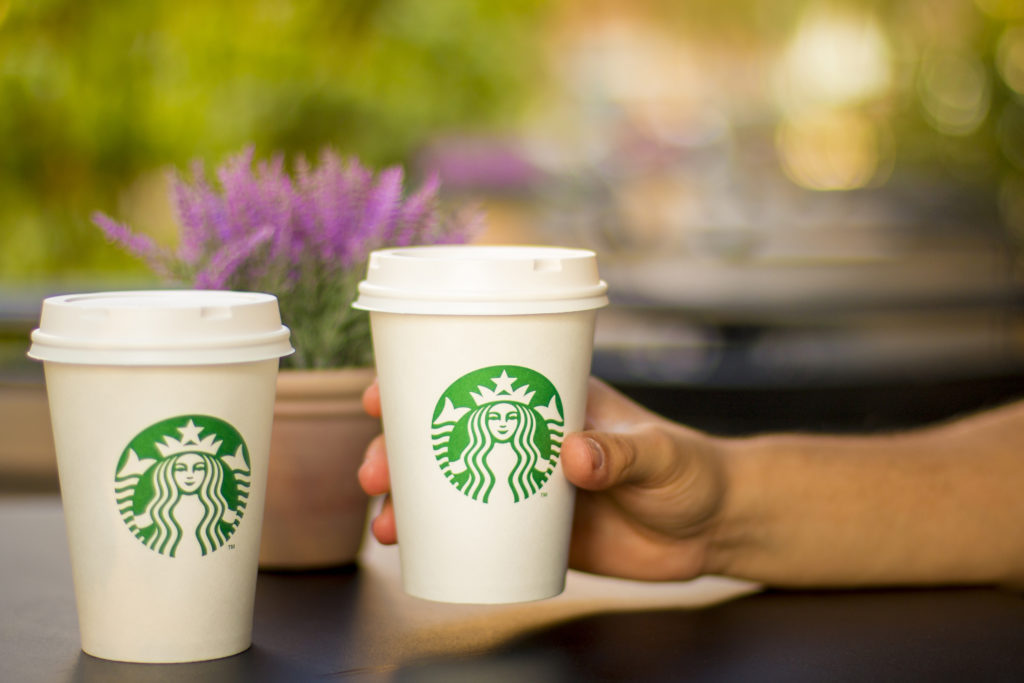
We may be a Circle K or Dunkin Donuts coffee nation, but you’d never know it based on brand power. Everyone in the U.S. recognizes the Starbucks siren instantly. In fact, since 2011 the logo has not included the word “Starbucks” because it doesn’t need to; we all recognize the logo alone.

Ford
Ford got us out of horse drawn carriages and onto the road for good, so it’s no wonder their logo is among the most recognized. Since 1907 the logo has been the famous blue oval; this incarnation of the logo coincided with the release of the Model A.
Microsoft
It may not be world’s most interesting or creative logo, but it’s one of the most ubiquitous; for that reason, the Microsoft window logo is one of the most popular. Pro tip: look for the slash between the first “o” and the “s” that was supposed to suggest speed in the version that dominated between 1987 and 2012.
Nike
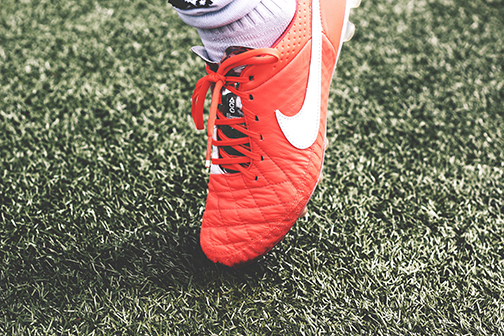
One of the most recognized brands in the world, Nike is certainly one of the most popular logos in the United States. The swoosh itself suggests speed and movement, and it now stands alone without the name of the brand.

McDonald’s
Another one of the global biggies, the golden arches of McDonald’s can now be found in countries all over the world—for better or worse. Thanks to a 2006 redesign, the golden “M” is now simpler than ever.
Apple
You can’t go into a coffee shop without seeing a sea of Apple logos, can you? This is one of those logos that has such brand power that it signifies something completely other than its literal meaning; no one who sees the logo thinks of produce. They think of technology, thanks to the power of the logo and brand.
Google has achieved the level of cultural significance that comes with your brand name having its own definition within the written and spoken language. When we say “Google,” we mean search for online. This is a masterful brand triumph, and the instant visual recognition we have of the Google logo is just as powerful.
Coca-Cola
Still one of the most recognized brands and logos in the world, in both urban and rural settings, the simple, optimistic colors and playful typeface of the Coca-Cola logo are distinctive. And despite the stylized and somewhat retro feel of the font, the logo maintains a youthful vibe even now.
Conclusion
There you have it, the most popular logos in the United States. Although some have been around for a lot longer than others, each is a standout in terms of sheer recognition power. Many of these logos have also undergone redesign during similar periods, which tells us that the most powerful brands know that staying current with design trends is a must even for them. Which of these will be on the list in another ten years? Only time will tell.